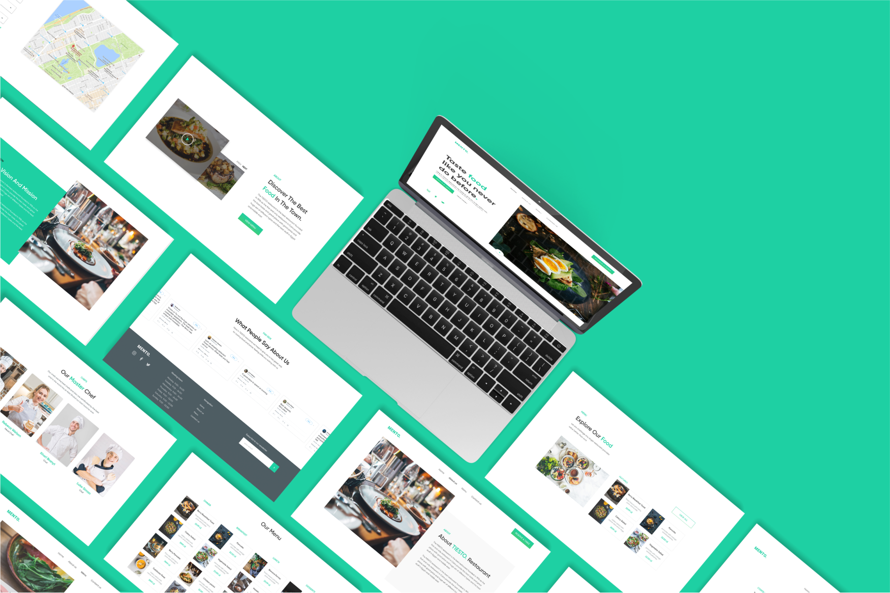

The principal aim of this case study is to demonstrate how an old-fashioned and impractical website was re-conceptualized, re-designed, and developed as a responsive, modern website using contemporary design practices. MENTO Restaurant in Cairo is popular, yet most of the restaurants’ website was already outdated in 2015–2016. So MENTO hires me to design their website with a user-centric approach.
The old website of MENTO Restaurant was outdated and was difficult to use. After scanning the website and talking with the restaurant staff, these were the main pain points. These problems were also verified by interviewing customers who visit the restaurant regularly.
1- Issues in responsiveness.
2-Difficulties in finding contents.
3-The problem of booking a table from the website. This was one of the main issues for users. Users find reservations is hard to approach because there are many inputs - which I found useless and confusing - and not clear CTA there like phone calling for people who didn’t understand how to use the MENTO website reservation service. And location service like Google maps or Apple maps isn’t used even with the 2023 website?
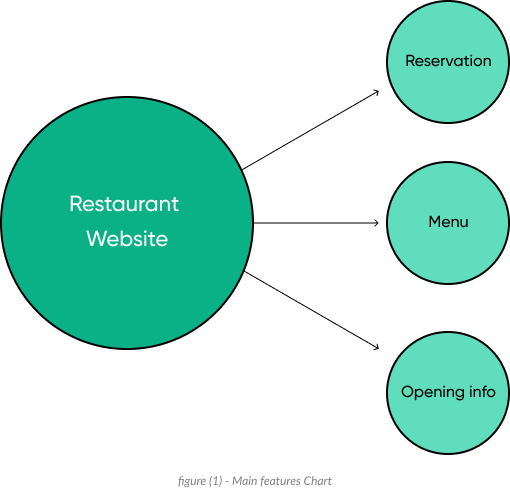
With a good understanding of what user really needs, I identify three main features in the website, and to make things clear you can see it in the figure below

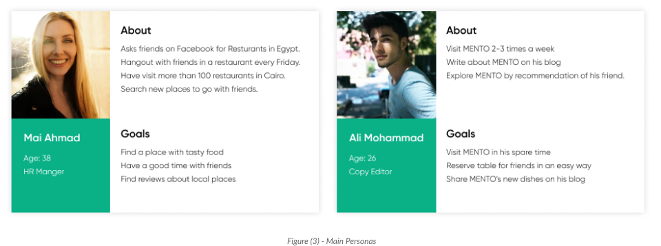
I used the personas method to better understand my users. I had two main types of target users — people who like to explore new places and people who are our regular visitors

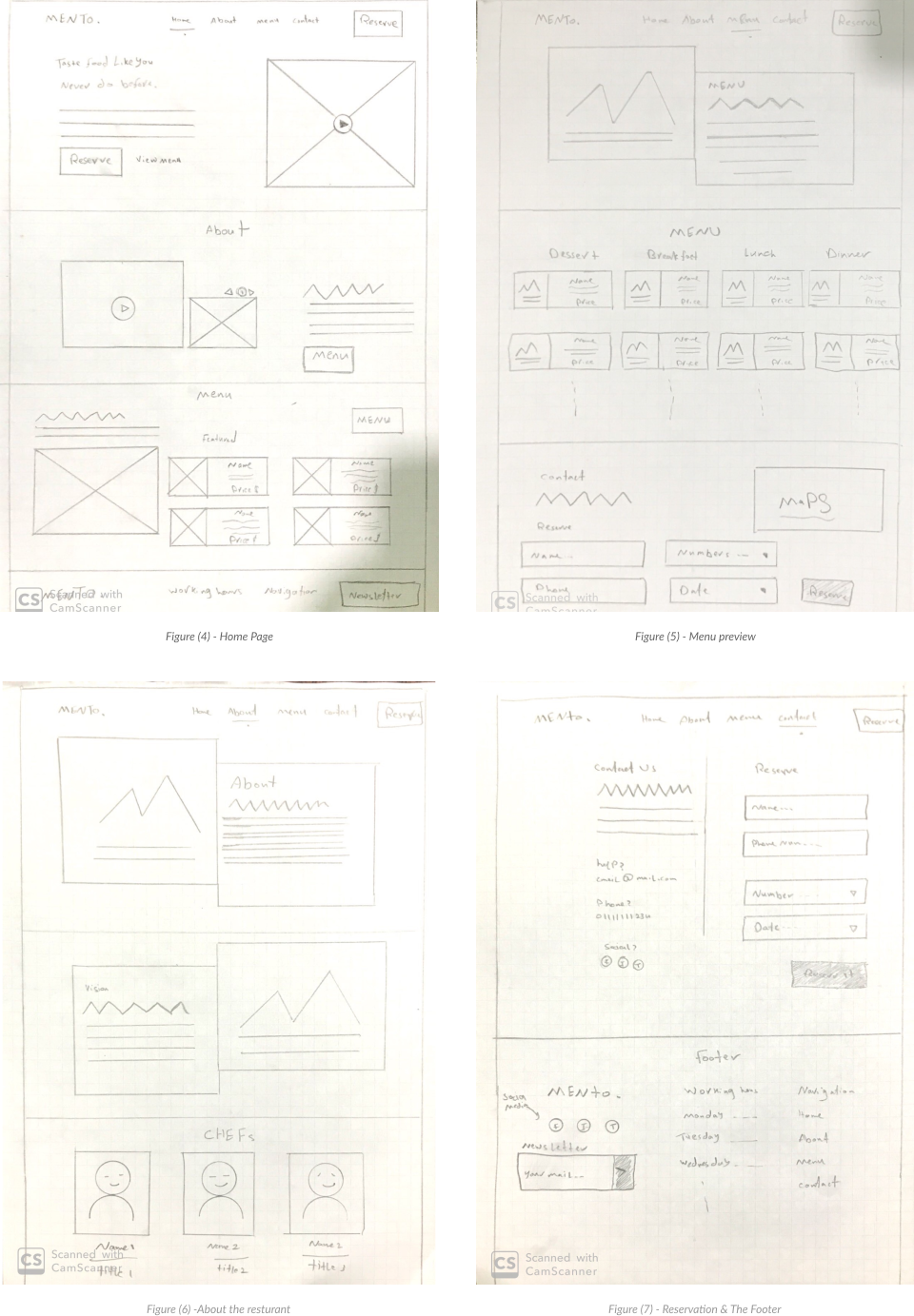
After collecting all the data and information from the Reseach process, I started designing the Flow and user journey and storytelling part. I used paper sketches my own secret
I used the personas method to better understand my users. I had two main types of target users — people who like to explore new places and people who are our regular visitors

After validate the main concepts, I created the prototype with Figma.
I improved the prototype during many iteration, which i found really exciting, The user tests resulted in a lot of information including valuable insights on how to solve users’ problems.

Building your digital products should feel this good.