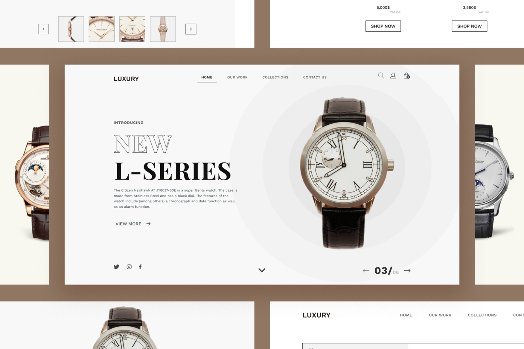

In late 2021, Luxury hired us to design and code their new e-commerce store where users could browse and buy collections of watches. In the midst of the North European cultural and fashion movement, Luxury headquarters are in a beautiful building (Luxurious House) that hosts the physical store, restaurant, offices and multimedia studios.
For this project, I was provided with a brief to design a brand new e-commerce website for Luxury store, a Swiss watches company. The primary goal of the new e-commerce website was to make products to be purchased online for delivery or in-store pickup. The site also needed to distinguish their watch series from other stores and brands which you can find it distributed in each place in Switzerland.
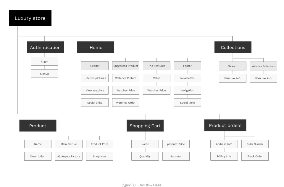
User flow usually helps me to understand the website structured very well. As the User Flow is a tool that allows to quickly map all the flow of screens of your website or app. User flow works well to align the paths and actions that the user can do.

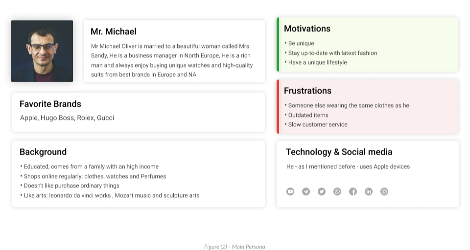
I used the personas method to better understand my users. I had two main types of target users — people who like to explore new places and people who are our regular visitors
Mr Michael Oliver is married to a beautiful woman called Mrs Sandy, He is a business manager in North Europe, He is a rich man and always enjoy buying unique watches and high-quality suits from best brands in Europe and NA

Ms Lara J. Robert is a single woman, She is a marketing manager at a great company, She has an above-average salary, She maintains her unique lifestyle and differentiate herself from the crowd.

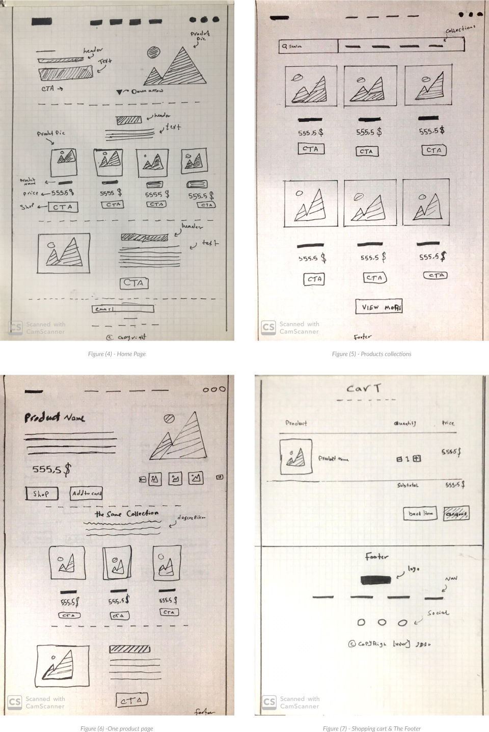
After organizing all the insights from the exploration phase, we started designing the web store. For this, the main tools we used were paper sketches and an interactive prototype.
I used the personas method to better understand my users. I had two main types of target users — people who like to explore new places and people who are our regular visitors

After validate the main concepts, I created the prototype with Figma.
I improved the prototype during many iteration, which i found really exciting, The user tests resulted in a lot of information including valuable insights on how to solve users’ problems.

Building your digital products should feel this good.